Add your promotional text...
Humanizing the Digital Maze
How Clarity in UX Builds Bridges to Success.
UX DESIGN
2/28/20255 min read


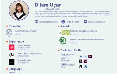
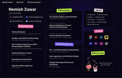
Recently, I had the opportunity to review a designer’s portfolio. When observing the presentation of their work, I noticed visual overload, with excessive use of colors and text, as well as a lack of white space that made reading difficult. This experience reminded me of the importance of clarity and organization in a portfolio. In the UX design world, where first impressions are crucial, a disorganized portfolio can be a major obstacle to professional success.
In this article, we will explore how the principles of clear interface design not only enhance digital experiences but also serve as powerful tools for building impactful portfolios and professional presentations—always keeping the user at the center of everything.
Principles of Clarity and Their Impact on Humans
Visual Hierarchy and Empathy in Project Presentation
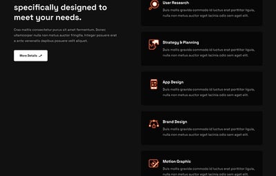
The concept of visual hierarchy is based on organizing page elements in a way that naturally guides the user through the content. Empathy plays a crucial role here, as it involves recognizing the user’s needs and expectations when interacting with the portfolio. If the design is unclear or if there are too many unprioritized elements, the user may feel lost or frustrated, which can leave a negative impression.
As Steve Krug reminds us in Don't Make Me Think, “Nothing important should be more than two clicks away.” In our portfolios, this means highlighting our best projects with a clear visual hierarchy, showing respect for the user’s time and attention.
Information Organization and Human Narrative
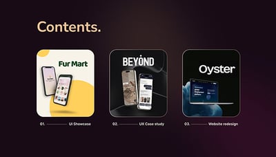
The secret to a professional narrative does not lie solely in the number of projects presented but in how they connect to tell a coherent and evolving story. As Richard Saul Wurman wisely states, “Confusion does not come from the amount of information but from its disorganization.”
For this reason, it is essential to structure your portfolio logically and emotionally, weaving a narrative that showcases not only your achievements but also your growth and the human impact behind each project.
To achieve this, use descriptive subtitles to segment information into clear blocks, bullet points to highlight key achievements and learnings, and generous white space to give readers moments of pause and reflection. This approach creates a visual dialogue that invites users to explore your story, making each section feel accessible and relevant while naturally showcasing your professional evolution.
User Flows and Empathetic Communication
Creating clear flows in your presentation means organizing your ideas so that each step is effortlessly understood. By structuring your content into coherent and visually distinct sections—using graphics, diagrams, and key points—you facilitate comprehension and demonstrate empathy toward the user.
This respects their time and allows them to quickly grasp the most relevant aspects of your design process. In this way, each element becomes part of a seamless conversation between the user and the portfolio creator, emphasizing both the logic and the human value behind design decisions.
Humanization in Practice
Online Portfolios: Showcasing the Human Side of Design
An online portfolio is much more than a collection of projects; it is a window into your identity as a designer. This reflects Luke Wroblewski’s warning that “Every unnecessary element in an interface is a distraction from the user’s main goal.”
Therefore, it is crucial to refine content and focus on what truly matters. This means: 1.Designing simple navigation and 2.An attractive visual presentation that reflects your personality and values, eliminating superfluous information, and emphasizing the real impact of your projects.
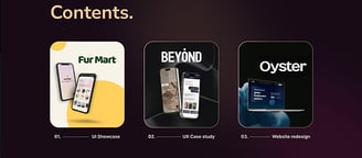
Use concise case studies focused on results, complemented by testimonials and quantifiable data, to illustrate how your work has driven positive change. This approach not only enhances the user experience but also humanizes your portfolio, authentically showcasing the transformative side of design.
Conclusion
As Donald Norman and Ben Shneiderman remind us, clarity is a transferable skill that allows us to build strong bridges between interface design and our professional future. By mastering these principles, we not only create better experiences for users but also prepare ourselves to craft impactful portfolios and communicate our ideas effectively—always with the goal of humanizing the digital maze.
Key Takeaways
Clarity and organization are fundamental skills for success in UX design.
Applying design principles: Concepts like visual hierarchy and storytelling are essential for both portfolio creation and professional communication.
The value of personal experience: Individual experiences and learnings add authenticity to content.
User humanization: This approach connects all areas of UX design, reminding us of the importance of keeping the user at the center.
Glossary
Empathy: The ability to understand and share another person’s feelings.
Gestalt: A set of psychological principles explaining how we perceive and organize visual information.
Interaction Design (IxD): The process of designing interactive products to improve the way users engage with them.
Usability: The ease with which a user can use a product or service to achieve a specific goal.
User-Centered Design (UCD): A design approach that prioritizes the user’s needs and desires at every stage of the creative process.
User Experience (UX): A person’s perception and response resulting from the use or anticipation of a product, system, or service.
User Flow: A visual representation of the path a user takes when interacting with a product or service.
User Interface (UI): The point of interaction between a user and a digital product or service.
Visual Hierarchy: The organization of visual elements to guide user attention and communicate the relative importance of information.
References
Krug, S. (2000). Don't Make Me Think. New Riders.
Nielsen, J. (1993). Usability Engineering. Academic Press.
Norman, D. A. (1988). The Design of Everyday Things. Doubleday.
Shneiderman, B. (1986). Designing the User Interface: Strategies for Effective Human-Computer Interaction. Addison-Wesley.
Wurman, R. S. (1989). Information Anxiety. Bantam Books.
Wroblewski, L. (2011). Mobile First. A Book Apart.


Subscribe to our newsletter
Receive an alert every time new useful content is published for your personal and professional development