Add your promotional text...
Portfolios That Inspire
Examples of Best Practices That Stand Out.
UX|UI DESIGN
3/4/20253 min read
In our previous articles, we have explored the fundamentals of user-centered design, the importance of empathy, and how to create digital experiences that truly connect with people. Don Norman, in his book The Design of Everyday Things (2013), highlights that “good design is transparent” and that every element should focus on the user experience. These principles apply not only to interfaces but also to how we present our own work.
A well-designed portfolio is essentially the practical application of these ideas—a window into your ability to create solutions that resonate with people. In this article, I invite you to explore inspiring portfolio examples and discover the best practices that will help you build your own.
What Makes a Portfolio Stand Out?
An outstanding portfolio is much more than just a collection of projects. It is a visual narrative that tells your story as a designer, showcasing your thought process, skills, and passion. Steve Krug, in his book Don't Make Me Think (2000), emphasizes the importance of clarity and ease of navigation: “If something requires too much explanation, it is not well designed.” This also applies to your portfolio—it should be easy to navigate, with a clear visual hierarchy that guides viewers through your work and, most importantly, highlights your thought process, explaining why you made specific decisions throughout the projects you showcase.
Whether you are a UX designer, product designer, graphic designer, or illustrator, a well-crafted portfolio is your introduction card—a powerful tool to open doors and connect with opportunities.
Analysis of Portfolio Examples
UX/UI Design Portfolio: Cordell Yee
Cordell Yee’s portfolio is a great example of clarity and structure. Each project includes a concise introduction, a breakdown of the design process, and tangible results, allowing viewers to understand not just the final product but also the reasoning behind each decision. This reflects Don Norman’s ideas on user-centered design, where a clear and logical narrative guides the visitor.
Graphic Design Portfolio: Queen Iwu
Queen Iwu’s portfolio combines a strong visual identity with intuitive navigation. It stands out for its effective use of typography—aligned with Ellen Lupton’s teachings—and a well-defined color palette that reinforces her personal style. Additionally, each project includes clear descriptions that explain objectives and solutions, providing context beyond the images.
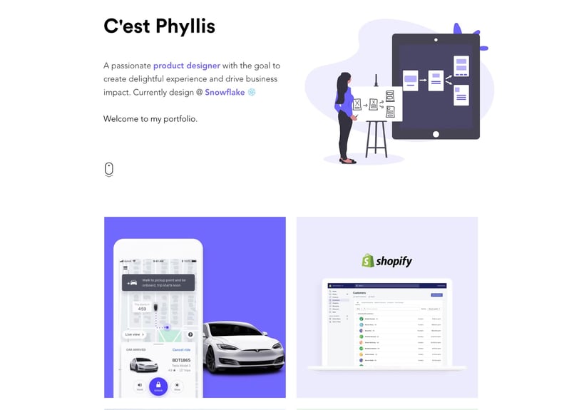
Illustration Portfolio: Phyllis Liu
Phyllis Liu’s work is a powerful example of how a portfolio can be both visually appealing and functional. The navigation is clean, the illustrations stand out with concise descriptions, and each piece reflects both creativity and structure. The visual simplicity allows visitors to focus on the artwork without distractions.
Best Practices and Tips
Learn from the best: Analyze portfolio examples from different disciplines and extract practical lessons. Observe how they apply Norman, Krug, and Lupton’s ideas to create effective experiences.
Tell your story: Your portfolio should be more than just images; showcase your professional journey, skills, and passion for design.
Show your process: Following Don Norman’s teachings, don’t just present final results. Explain the why behind each decision.
Focus on results: Highlight the impact of your work with data and testimonials whenever possible.
Be original: Get inspired by others, but create a portfolio that reflects your own identity and style.
Conclusion: Looking Ahead
An inspiring portfolio is a powerful tool to stand out in the design world. By applying the best practices we have explored—based on the ideas of authors such as Don Norman, Steve Krug, and Ellen Lupton—you can create a portfolio that not only showcases your talent but also connects with your audience on a human level.
I invite you to take action: build a portfolio that reflects your passion and vision. Keep exploring, learning, and improving your ability to communicate through design. In our upcoming articles, we will dive deeper into topics related to professional development and effective project presentation.
Glossary
Best practices: Actions or methods considered effective and recommended for achieving good results.
Clarity: The quality of being easy to understand, without confusion.
Color palette: The selection of colors used in a design, ensuring they work well together.
Consistency: Maintaining a uniform style or design to ensure everything looks connected and logical.
Creativity: The ability to generate new and original ideas.
Empathy: The ability to understand and feel what another person is experiencing.
Navigation: The way people move through or explore a website or digital portfolio.
Originality: Being unique and different, showcasing your own style or ideas.
Passion: A strong feeling of enthusiasm or interest in something.
Professionalism: Acting with responsibility, quality, and seriousness in your work.
Thought process: The steps you take to solve a problem or create something new.
Typography: The style and design of letters used in a text or design.
User-centered design: Creating products or experiences with a primary focus on the needs and desires of the people who will use them.
Visual narrative: Telling a story through images, graphics, or designs without needing too many words.
Bibliography
Krug, S. (2000). Don't Make Me Think. New Riders.
Lupton, E. (2010). Thinking with Type: A Critical Guide for Designers, Writers, Editors, & Students. Princeton Architectural Press.
Norman, D. A. (2013). The Design of Everyday Things. Basic Books.
Cover image: Portfolio of Phyllis Liu – phyllosophy.me
Subscribe to our newsletter
Receive an alert every time new useful content is published for your personal and professional development